
Pryamaya Rech — the largest independent cultural platform in Russia and Russian-speaking Europe
An education and culture project founded in 2010. For over 15 years it has hosted lectures, talks, and concerts with outstanding contemporaries — writers, scientists, and artists. Events run both in person and as live online broadcasts, for adults and children alike. The platform serves two audiences — Russian and European — and, alongside the events themselves, runs a large online archive of lectures on subscription.
Alla Gerber, Nicole Plieva, Andrey Makarov, Tatyana Chernigovskaya, Vladimir Pozner, Vladimir Alipov, Evgeny Tsyganov, Igor Vernik, Veniamin Smekhov, Ilya Gomyranov, Andrey Zvyagintsev, Tatyana Tolstaya, Sofiko Shevardnadze & Duncan Lorien, Andrey Kurpatov.
My role and ownership
Since 2014 I've led the platform's digital products end to end — from research and hypotheses to interfaces, engineering handoff, and design review — with a focus on growing key metrics, conversion, and retention. Over these years I owned more than design: as design director I set the visual language and product standards, and as product manager I drove the roadmap, priorities, and hypotheses.
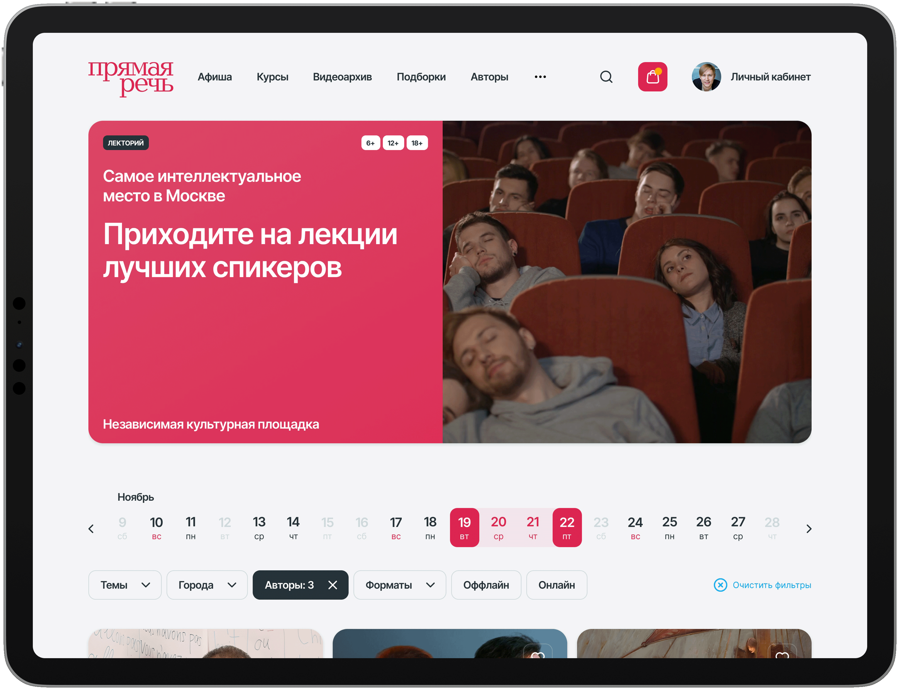
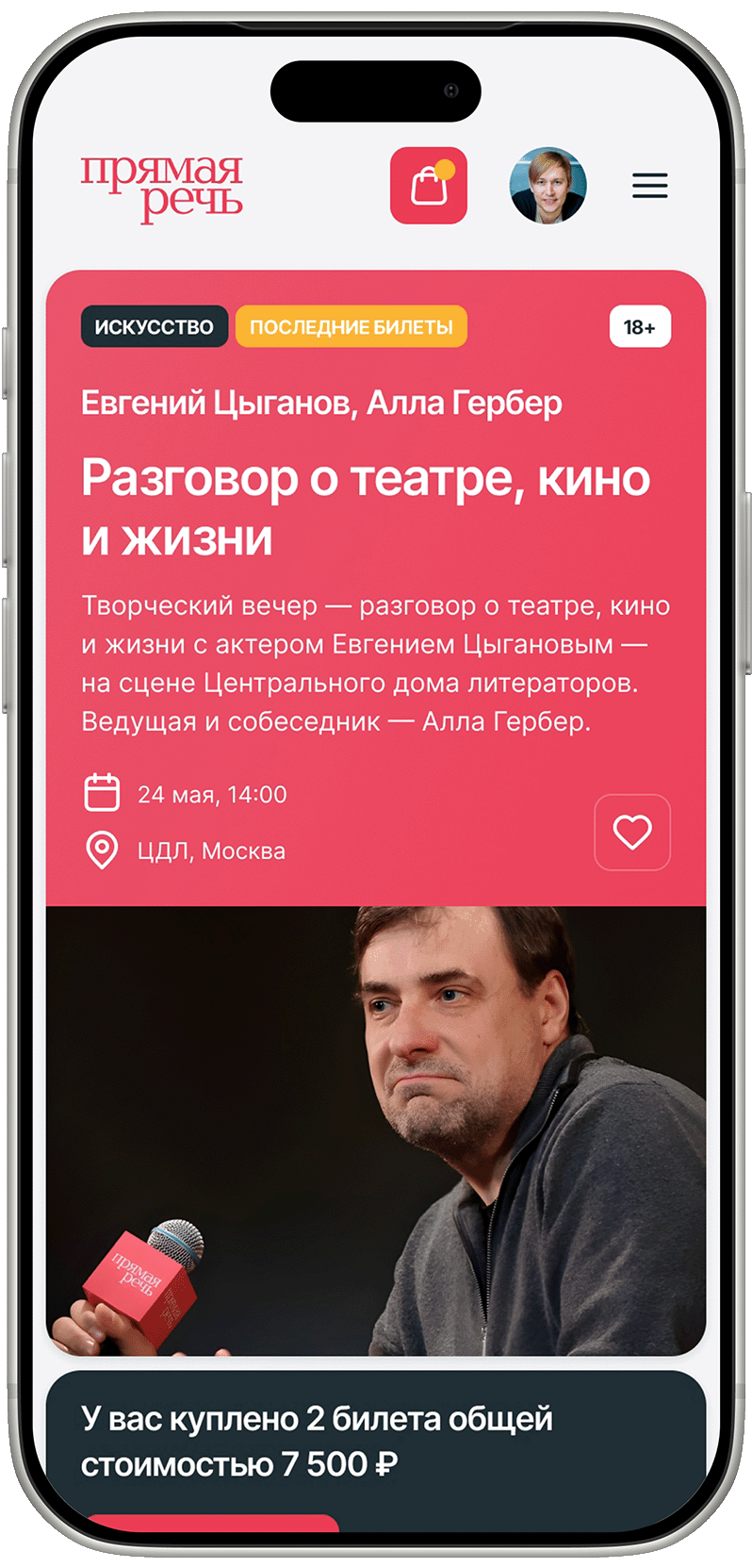
The audience splits by device — desktop for older users, mobile for younger ones — so the mobile version isn't trimmed down to a storefront: it carries the full scenario end to end — catalog, seat selection, payment, subscription. Here responsive design is about care for the user, not a checkbox.
The problem
Over the years the platform built up a large program, and it became hard to navigate: people struggled to find the right lecture and stumbled at checkout. The site structure got in the way — the homepage acted as a storefront and the main entry point, even though users landed straight on specific lecture pages from search, newsletters, and social. The points where the buying decision was made and the points where attention was invested didn't line up.
A separate, less obvious problem was the online archive and subscription: a valuable product that lived in the interface only as a menu link, and so went almost unnoticed.
The homepage worked as a storefront — but people didn't land there; they came straight to the lecture pages.
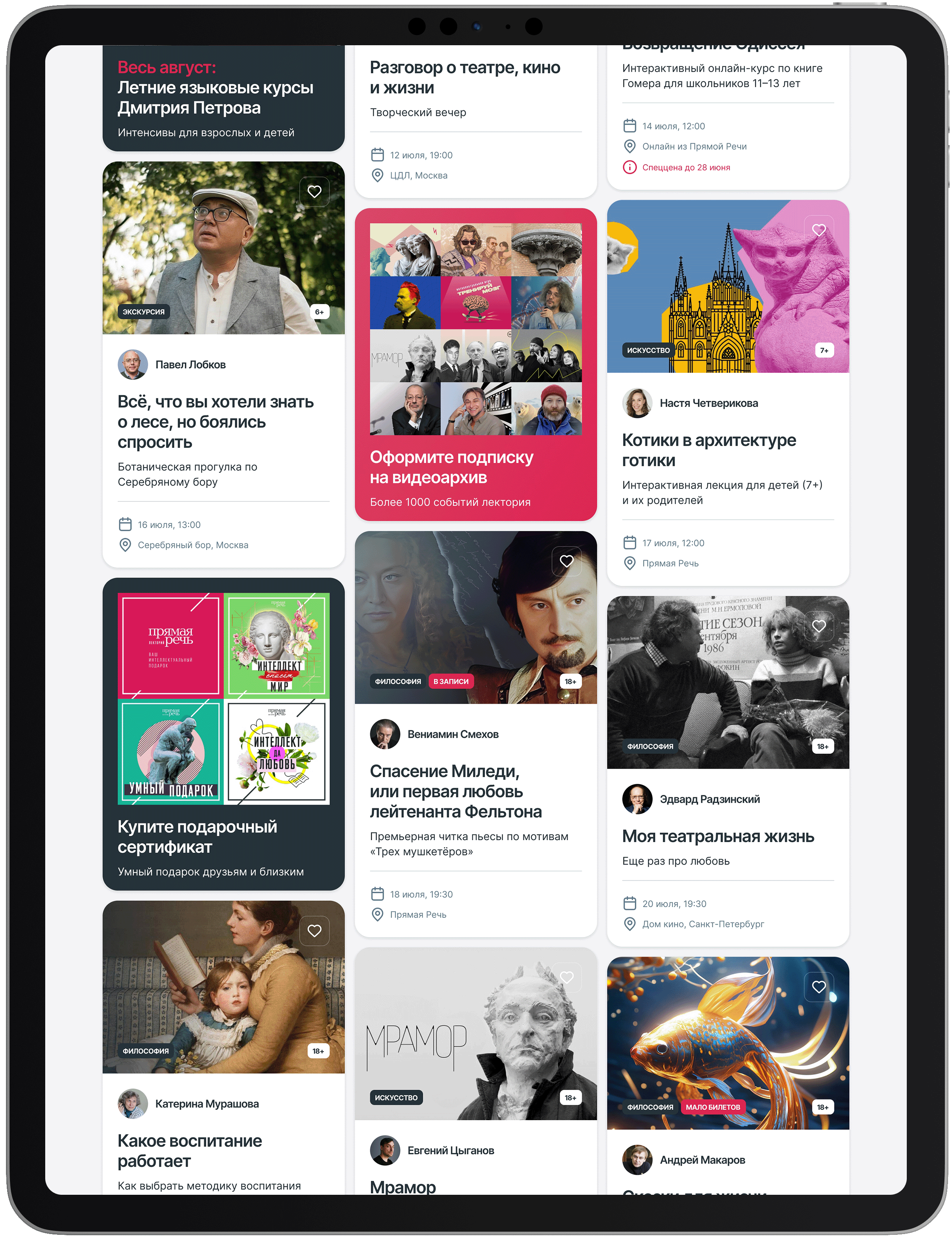
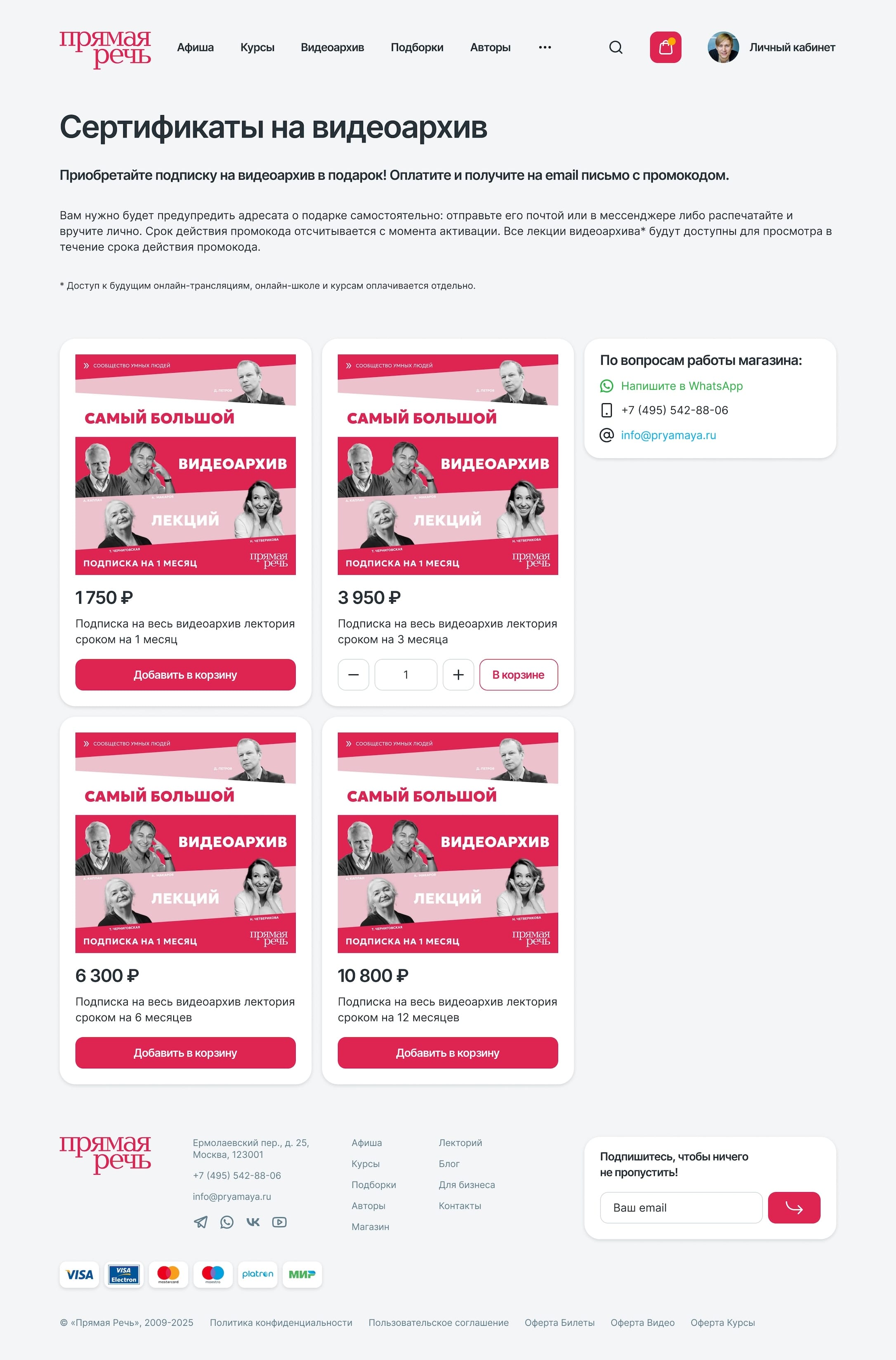
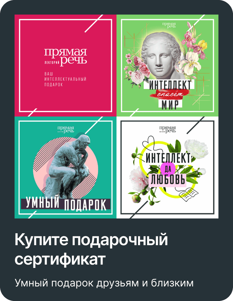
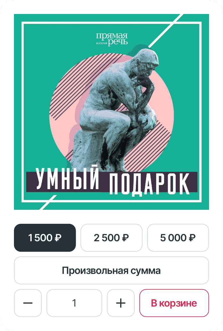
Subscription and gift-certificate cards are built into the general flow of events rather than hidden in a separate section. That's the very move that drove a fivefold increase in subscription sales.
How I found it
The picture came together from three sources. Behavioral analytics showed where people got stuck on the way to purchase and how few even reached the archive. A lot of feedback came directly from users — most actively from the older part of the audience, who hit difficulties on the platform more than others and usually preferred to call. And walking the scenarios step by step showed that the archive and subscription had to be sought out on purpose, instead of being met where a person was already choosing something.
What I did
I worked on two levels at once — an overall rework of the site and a targeted surfacing of the archive. Over 11 years the product went through three redesigns, the launch of a separate European version, and the integration of ticketing services.
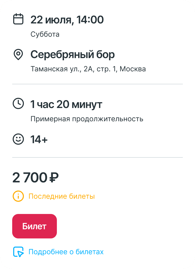
On the site I rethought the information architecture and shifted the product focus from the homepage to individual lecture and course pages, turning them into full entry and conversion points. I reworked navigation, the catalog, the event card, and the purchase flow so the path to a ticket got shorter and clearer. I built a new visual style, components, and a design system, the responsive layout, and a dedicated interface version for the European audience.
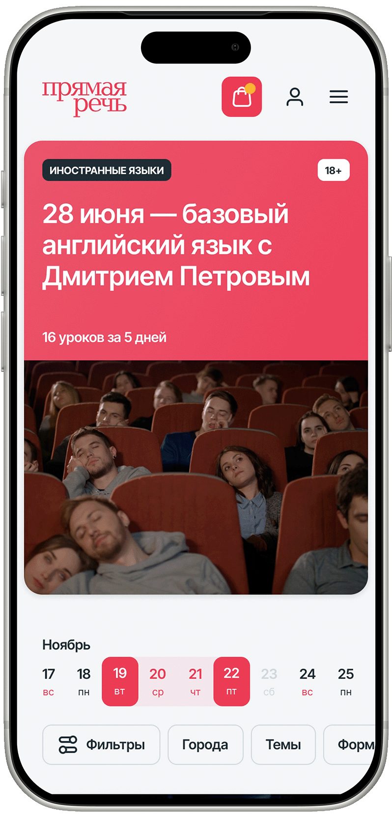
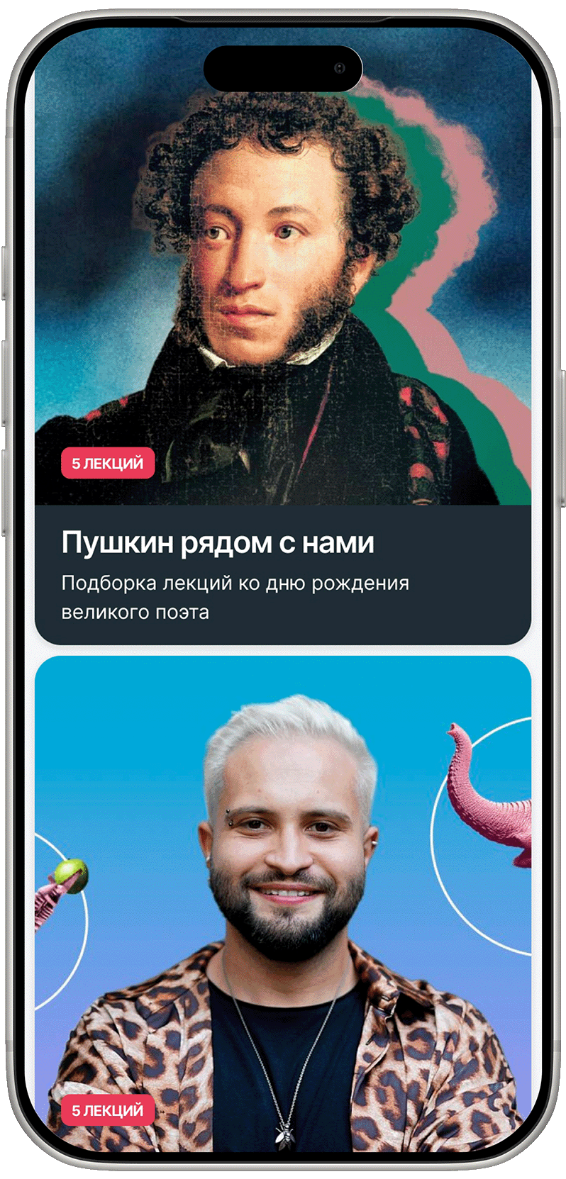
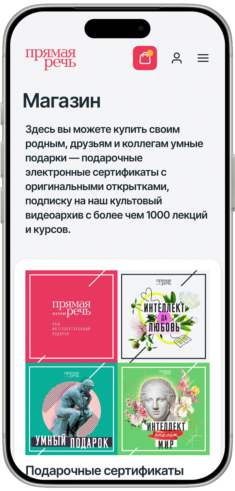
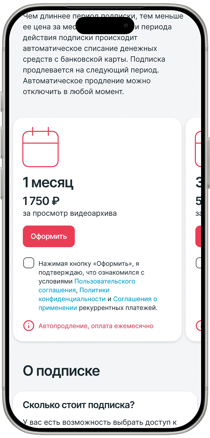
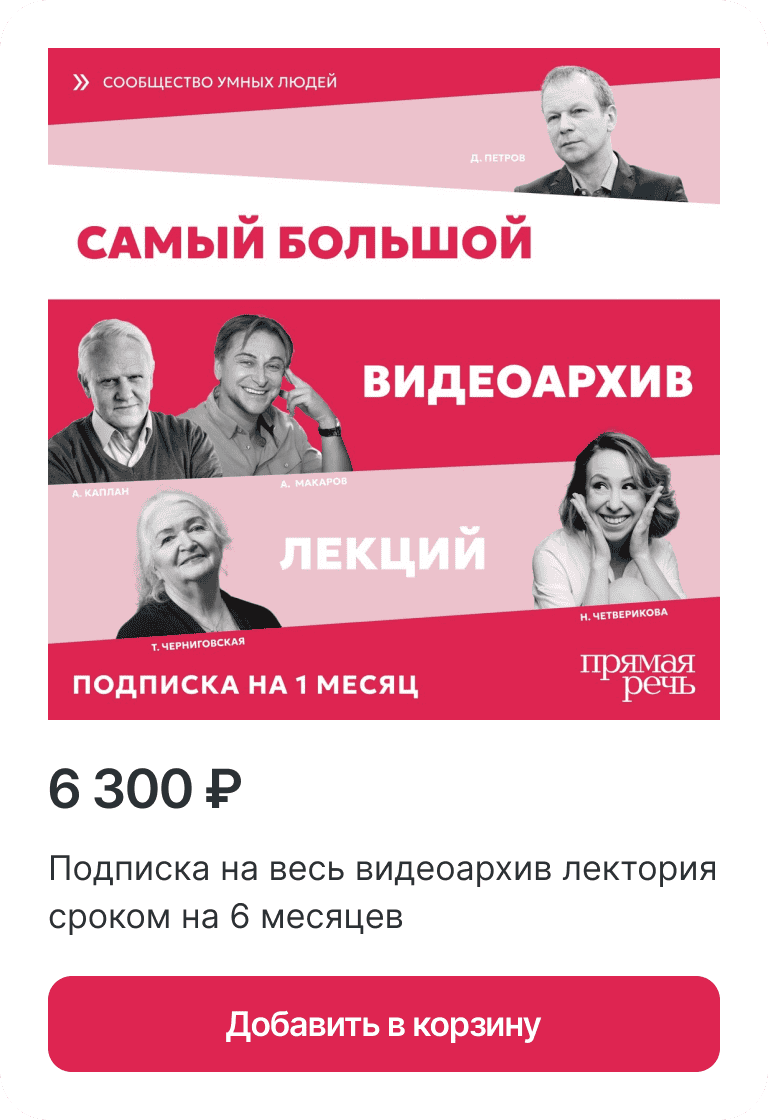
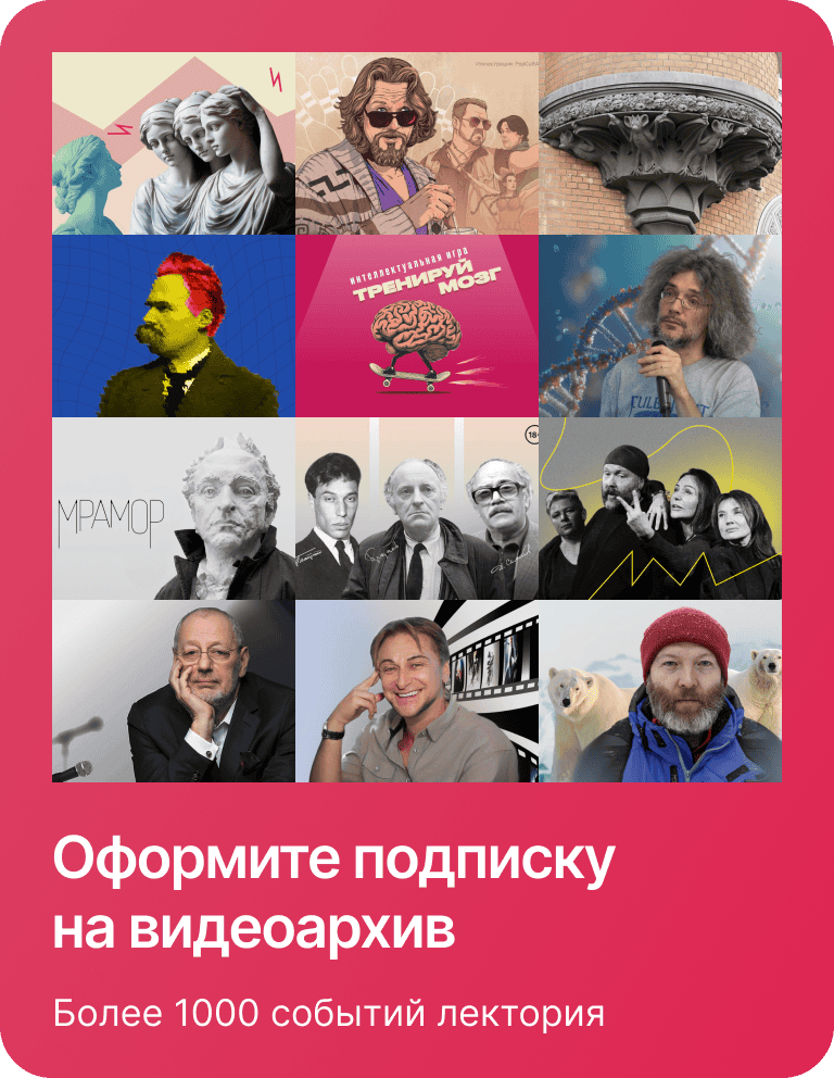
Events, collections, subscriptions, and certificates — in one flow of cards with filters by genre, city, speaker, and format. Themed, seasonal, and age-based collections. Terms from one to six months, transparent value for longer commitments, and an FAQ block. Monthly and half-year subscriptions grew the most.
Instead of a menu link — the archive and subscription as cards, right where a person is already deciding.
I gave the archive separate attention. Instead of a menu link, I proposed presenting it through themed, seasonal, age-based, and holiday collections, worked out the subscription range — from single to annual — and the option to gift a subscription to a friend. Most importantly, I surfaced the archive and subscription as cards right where a person is already deciding: in the general events feed and in the "See also" block on lecture pages.
Beyond the interface, the product decisions were fully on me: hypotheses and experiments, funnel analytics, writing tasks for engineering and detailed specs, integrating several ticketing platforms with seat selection and online payment, and introducing AI automation to produce content for social.
Where I got it wrong
Not everything worked the first time. I first put the archive and subscription promotion in the homepage feed — it seemed logical to show what's new where "everyone" is. But that contradicted what I'd found myself: the main traffic went not to the homepage but straight to event pages. Part of the audience simply never saw the new cards, and subscriptions grew more slowly than I'd expected at first. Once I caught this in the metrics and feedback, I moved the emphasis to cards inside event pages and the "See also" block — where attention is actually concentrated.
A separate difficulty was payment: each event has its own logic (format, seat selection, cancellation rules), and at the seams of these conditions checkout would sometimes break. The main lesson wasn't about the bug itself but about method.
I stopped blaming the interface first and started by reproducing it under the user's conditions.











Results

growth in event-card CTR after launching the updated Moscow version.

the European version's lead over the Russian one across key metrics — conversion, view depth, sales — in its first two months, and it keeps widening. Part of the effect is a more solvent audience and a low starting base for a new market, but the scale of the gap confirmed that the architecture rethought for Europe hit its audience.

growth in online-archive subscription sales once collections and subscription options landed in the core user scenarios; demand for monthly and half-year plans rose noticeably.

growth in organic traffic to the Telegram channel after introducing AI automation for content production — a separate content-marketing initiative for the platform.